Logo, stationery
Pourquoi – Branding
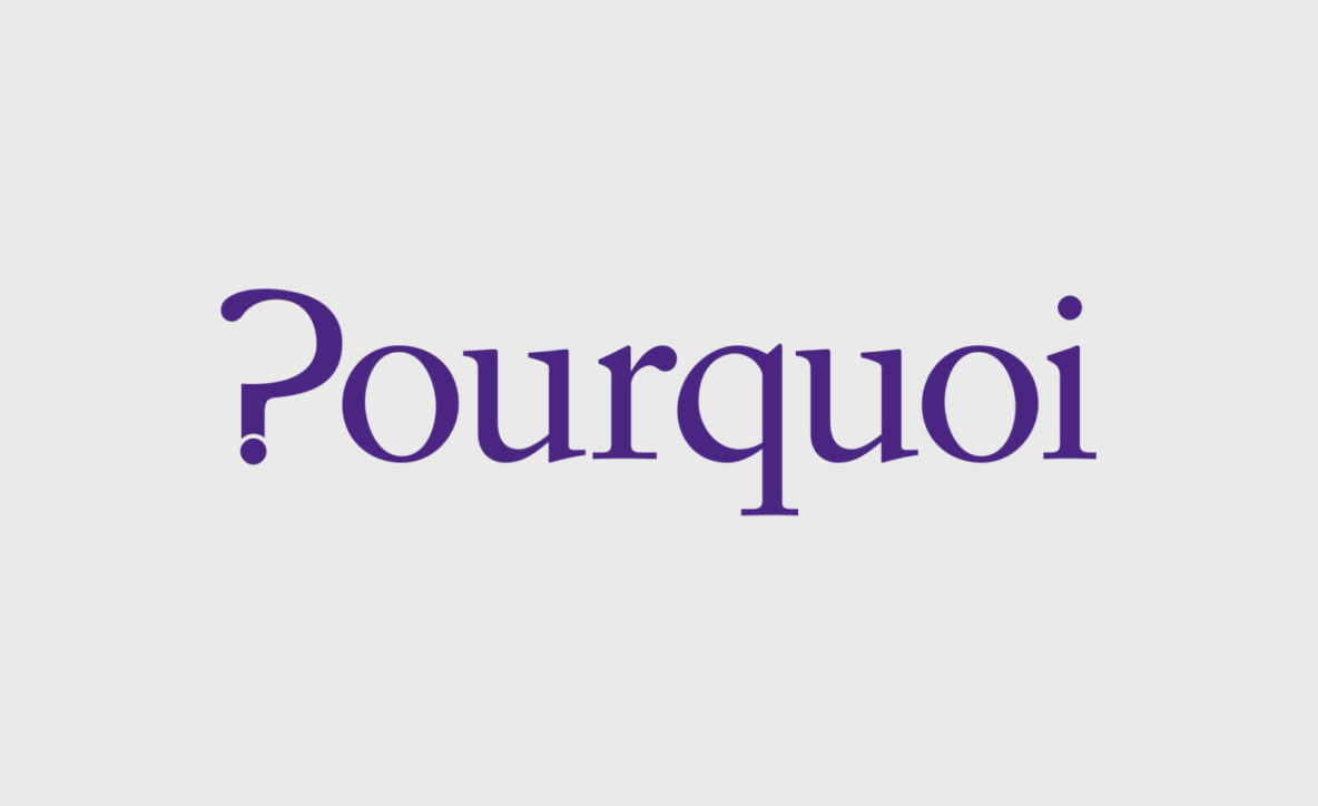
Pourquoi are a leadership and innovation coaching and advisory service. A typographical solution where the translation is communicated through the typography, creating a simple and memorable brand.
Oakdene Emporium – Branding
Oakdene is an antique, vintage and collectable dealer, selling both online and via open days at their showroom. A strong brandmark that is ecclectic, using a vintage badge shape and a mix of retro and traditional fonts. A woodgrain texture runs through the logo to pay hommage to the name, and add a rustic feel.

- Page 2 of 2
- 1
- 2